Garmin
UI/UX
Garmin International
Duration: 15 weeks (January - May 2019)
Context: UX Learning Studio Project
Tools: Figma, Sketch, and Keynote
Skills: Research, Interviews, Affinity Diagram, Heuristic Analysis,
Survey and Synthesis, Comparative Analysis, Ideation, and Low-
High fidelity prototyping.
Team: Abbee Westbrook, Patsy Mata, Hunter Hollinger,
Austin Johnson, Will Kaufman, Amelia Fleetwood, Isabella Pino,
Rheaa Kamath (me!)
Platform: Mobile
Project Summary
Company Overview
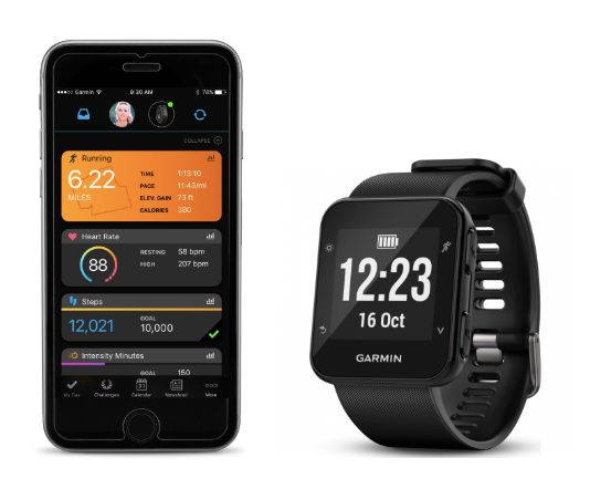
Garmin International is an American multinational technology company that delivers innovative GPS technology across diverse markets, including aviation, marine, fitness, outdoor recreation, tracking, and mobile apps.
Project Overview
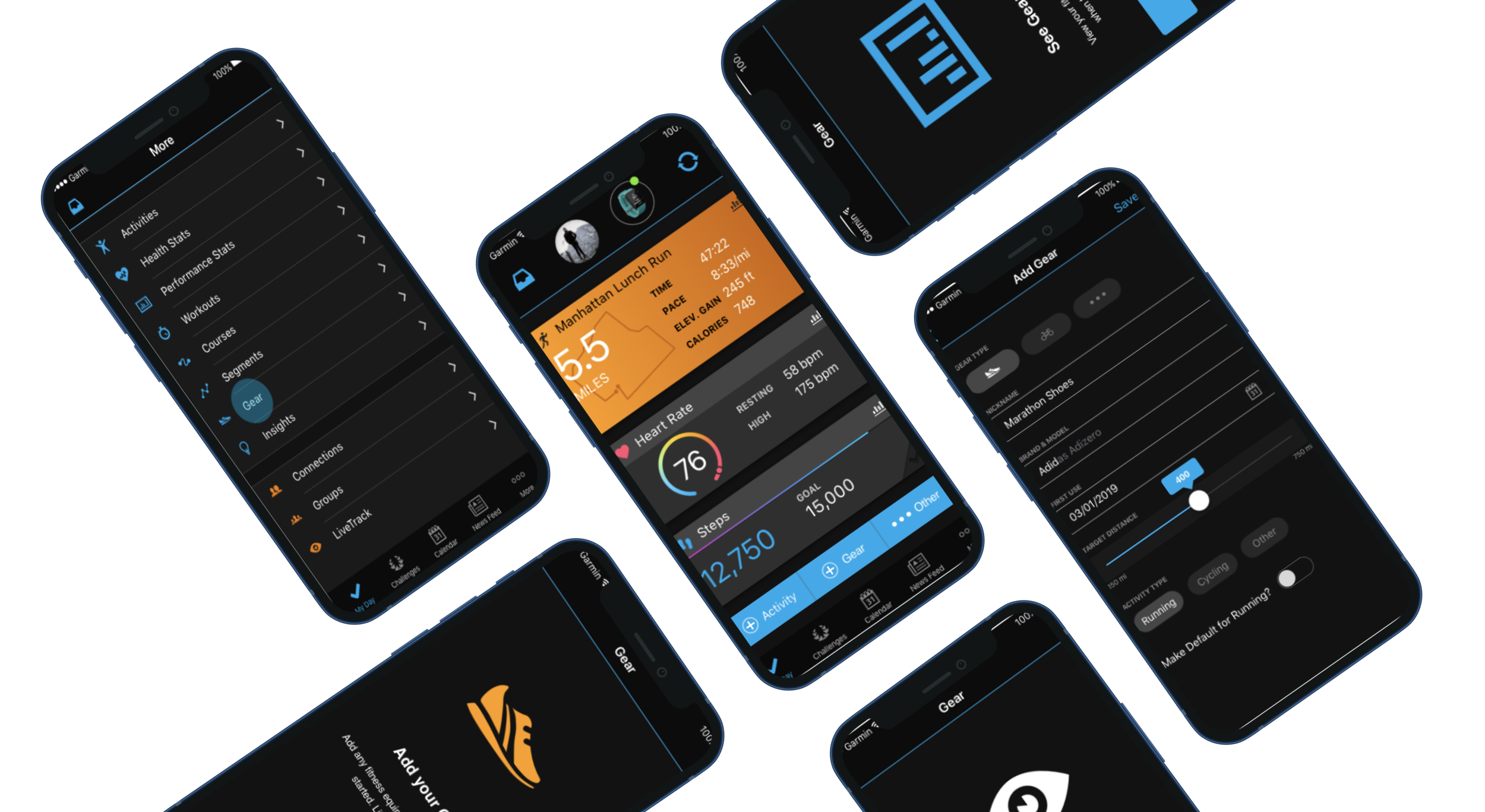
Garmin International sponsored an experience studio project during the spring of 2019. Our team was tasked to improve the Gear feature within the Garmin Connect mobile application by bringing more awareness to it, creating a more intuitive experience for users, and refine its overall aesthetic.
Gear is a Garmin Connect feature that allows users to add gear (shoes, bikes, other) to their activities. Garmin Connect tracks the total distance associated with the gear and notifies the user when it has reached capacity. A user can retire and add more gear.
We worked closely with our sponsors, Paige Fisher (UX Designer at Garmin) and Kurt Iverson (UX Team Lead at Garmin, whom we would communicate with biweekly remotely. Throughout the semester, our team’s scope changed multiple times based on the feedback that we got from our sponsors, professors, and peers.
Problem Statement
We have observed that the Gear feature is not discoverable within the Garmin Connect App, which is preventing users from integrating Gear into their fitness routines. How might we improve so that Gear is more successful based on A/B testing and the success rate of discoverability?
Goal: Improve Gear’s functionality and discoverability in order to increase usage
Problem: Gear lacks discoverability preventing users from integrating Gear into their fitness routine
Solution: Increased integration of Gear throughout Garmin Connect Mobile as well as introduced a new design
User Group
Garmin initially proposed that we should focus on three main user groups: runners, cyclists, and hikers. However we decided to scope down on our initial users based on the data from our survey results. We got rid of hikers leaving us with runners and cyclists as our main user group.
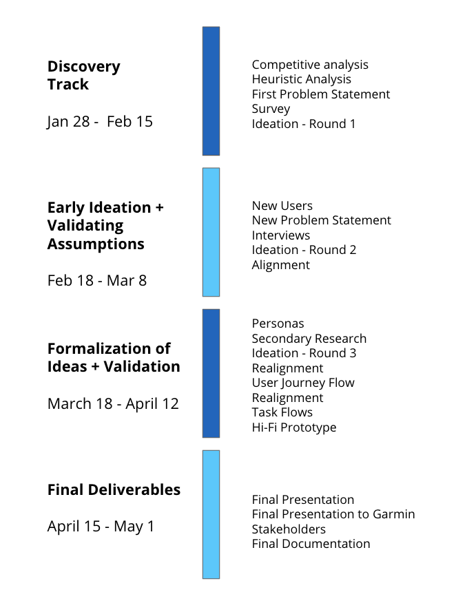
Timeline
Research
Competitive Analysis
We began by conducting competitive analysis on applications that accomplished similar gear-tracking and run-tracking capabilities as Garmin Connect. Both of the apps we used in our analysis are gear-tracking apps. In this case, both track shoes, as we could not find biking or hiking gear trackers.
Goal
Identify and evaluate the strengths and weaknesses of Gear's
competitors
Method
Compare and contrast two applications that accomplished
similar gear-tracking and non-tracking capabilities
Results of Competitive Analysis
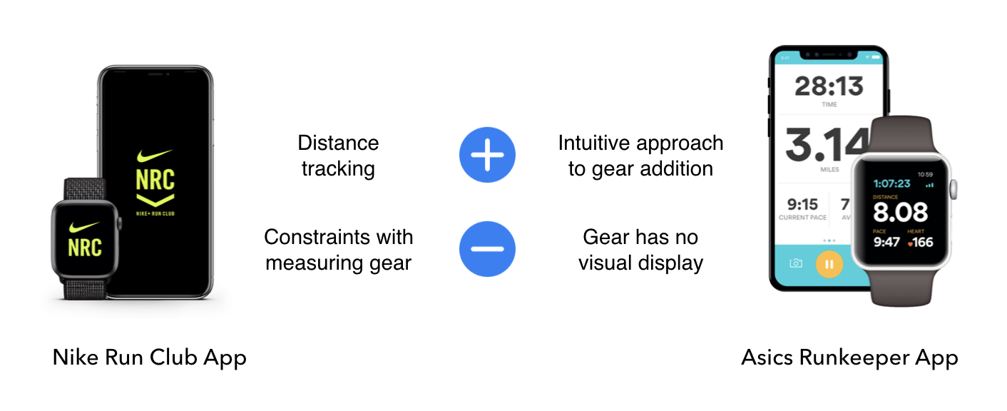
Here are some of the main takeaways from competitive analysis:
Suggesting brand and model suggestions offloads stress about knowing specific model names from users
It’s important to have a clear, straightforward path to finding gear
Flexibility in adding, editing, and removing gear maximizes user customization
Survey
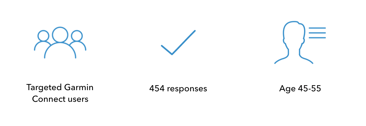
For this survey, we wanted to get more quantitative data on our 3 personas types, Runners, Hikers, and Cyclers, as well as Garmin users. We mapped out a path for each of these user types, which came to about 24 questions per participant. The goals for they survey were to get to know our users better, to better understand the users’ fitness habits, and the usage of Garmin gear within their fitness routine.
Who took the survey?
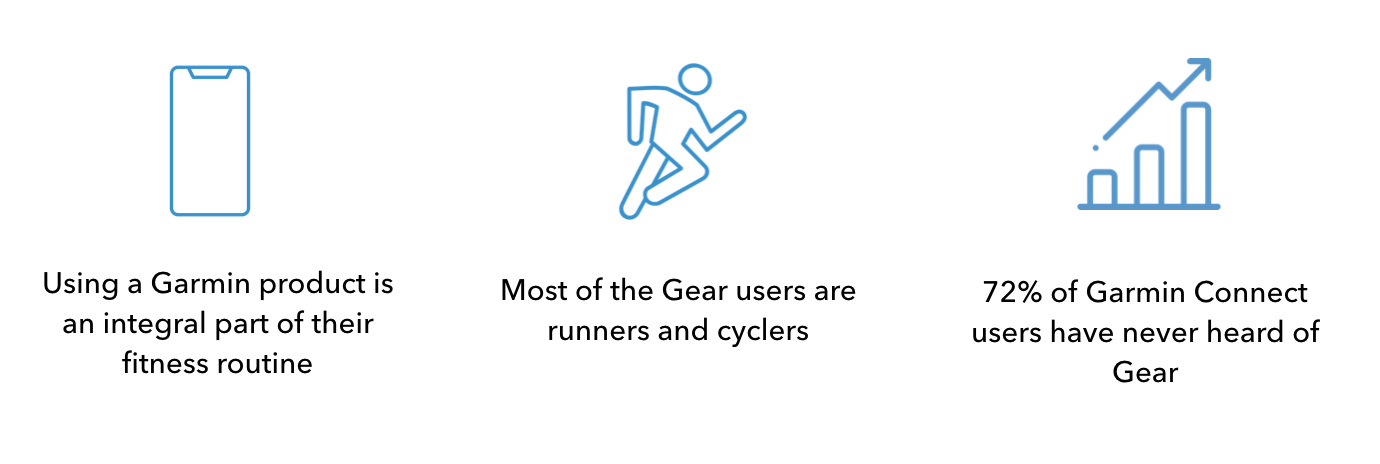
Key Takeaways:
Interviews
Qualitative Interviews were used to gain deeper understanding of the respondents of the survey. 5 interviews with running respondents from the Quantitative survey were performed. Questions about routines, Garmin usage, and their typical flow. The goals for interviews were to find additional pain points in the Garmin Connect experience, find reasons why people would or wouldn’t track their equipment, and understand current users knowledge of Gear feature.
Who did we interview?

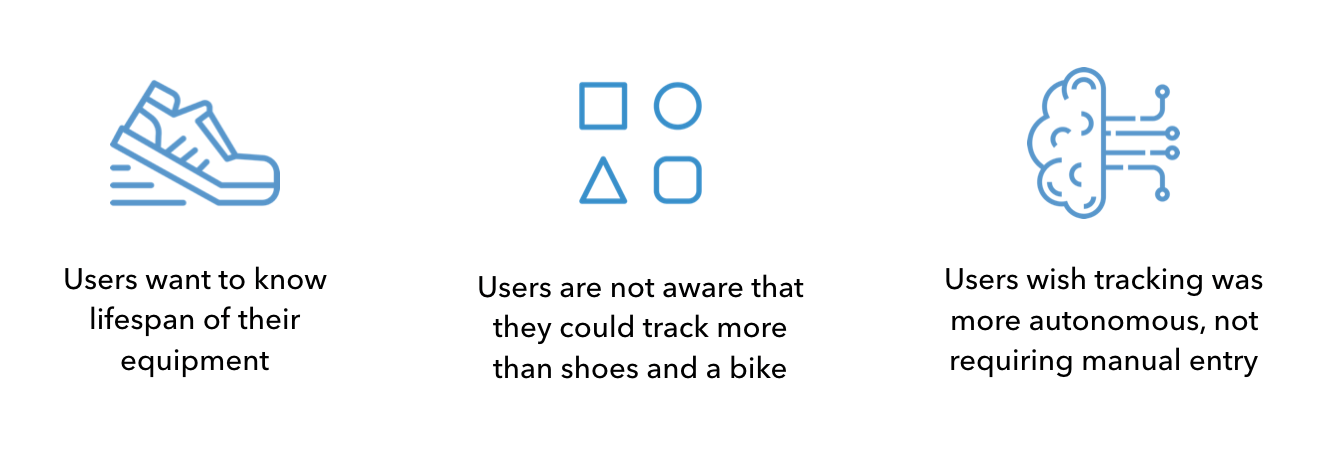
Key Takeaways:
Ideation & Testing
Low-Mid fidelity Prototype
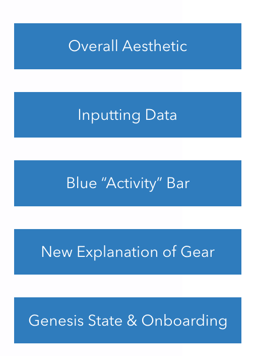
We did multiple rounds of sketching and ideation throughout the entire course of the project, however after narrowing down our user group as well as our problem space, we decided to focus our last round of ideation into Garmin’s recommended categories; inputting data, Genesis State & Onboarding, Blue “Activity” Bar, New Explanation of Gear, and Overall Aesthetic.
Above are some of the low-fi wireframes that I created during the first two round of ideation. Some of these concepts that were ideated upon were implemented in the final app design concept.
1) The first image is a sketch that aims to bringing more awareness to the gear feature which was hidden within the “more” section of the Garmin Connect App. The Gear feature was placed in the nav bar in order to improve the lack of discoverability. However, our sponsors told us that this could not be integrated into the app due to company policies.
2) The second image is a low-fi wireframe created in Figma for the category of “Gear Collection”. My goal was to help users easily visualize the use of their gear, so that once the gear reaches its max, users know exactly when to retire and add new gear. This circular progression bar was incorporated into our final design.
3) The third image is a low-fi wireframe created in Figma for the “Blue Bar” present on the My Day screen of the Garmin Connect App. The Gear feature is hidden within the “more” section of the app, so bringing it to the home page of the app would help bring more awareness to it, allowing users to locate and utilize it easily.
Hi-fidelity Prototype
Below are the original and new screens that we created based on the five problems that we identified and wanted to address through our hi-fidelity prototypes created in Sketch.
The five categories were:
Onboarding
We identified that the original screen doesn't help a novice user understand the core functionality of the gear feature nor does it guide them on how to use it. Our design on the other hand gives users a brief run through of its key functionalities and how to get started. I created these three new screens for onboarding with the help of the UI Kit that Garmin provided us with.
Gear Collection
We identified that the original screen doesn't really allow users to view active/inactive gear in an easy and intuitive way. Our design on the other hand allows users to view all, active and inactive gear with the help of the bar on top as well as a filter functionality that can filter gear based on age, distance, lifespan etc. The circular progress bars were inspired by the low fidelity designs that I created shown in the low-mid fidelity section of ideation.
Adding Gear
In the current version of the app, when a user enters data, they are brought to a new page with no ‘Submit’ button, increasing the amount of clicks. This has been simplified with our design by keeping text entry on the same page, providing an ease of flow for users. In addition a slider bar with upper and lower thresholds was created to act as a suggestion for novice users. A toggle button is added to allow users to make their gear default for any activity. I was responsible for creating the slider bar, Activity type, and toggle sections of this screen.
Blue “Activity” Bar
In the current version of the app, the gear feature is hidden within the "More" section of the bottom navigation bar. In our new version, Gear has been added to the Blue Bar on the My Day screen which is the home page. This brings awareness to the feature accomplishing our goal of increasing Gear's discoverability. The blue bar was inspired by the low-fi version that I ideated upon and I was responsible in creating the hi-fi version on the screen below.
A/B Testing
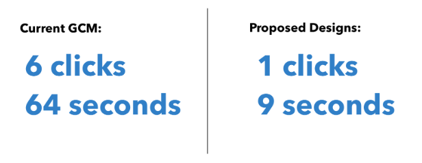
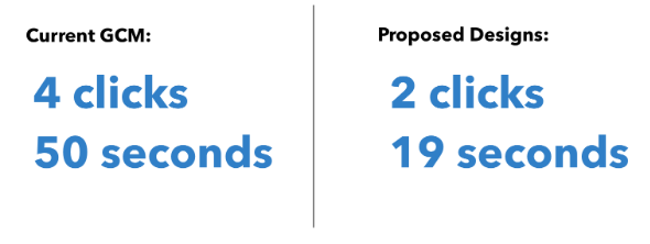
Goal: To determine if the proposed designs increase Gear’s visibility and user’s understanding of Gear. We conducted A/B testing using two scenarios, including the current Garmin Connect Application and our final solution. We had 7-10 participants that tested each scenario. The participants were timed and the number of clicks were recorded.
Scenario 1: The participants needed to navigate through the Gear function within the current Garmin Connect application
Results:
Scenario 2: The participants needed to check their most recent run to see if the Brooks Transcend 6 is listed as the default Gear.
Results:
Here are the key takeaways from the A/B Testing:
By comparing both the current and our solution, there was a result of less time and fewer clicks that were made using our solution.
For the current application, the participant found it difficult to navigate to Gear within the current Garmin Connect application. There were many times where the users would click around until they found gear.
In addition, the participants were more aware and understood the value from our solution.
A Moment of Reflection…
This was my first experience studio project and it really helped me get a sense of how an actual job in UX would be like. Getting exposed to industry level projects like these as a freshman is overwhelming yet immensely rewarding at the end because of all the skills that I was able to learn along the way. I cannot be more thankful for this opportunity and for all the people that made this project a success!
Thank you to an amazing team for being committed to help each other out as well as for all the mentorship that was provided by the upperclassmen. I also wanted to thank our professors and our sponsors, Paige and Kurt for all the feedback and guidance they gave us throughout this process!
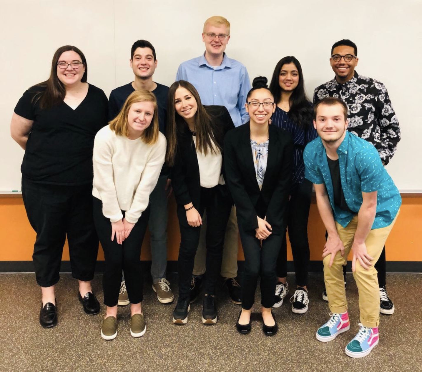
Back Row (Left to Right): Abbee Westbrook (Co-lead), Will Kaufman (Team member), Hunter Hollinger (Team member), Me (Team member), Drake Long (Project Owner) Front Row (Left to Right): Amelia Fleetwood (Team member), Isabella Pino (Team member), Patsy Mata (Co-lead), and Austin Johnson (Team member)
Thank you :)


